|
The John Sartain mezzotint engraving (to the right)
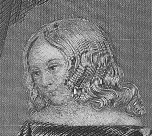
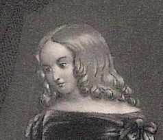
, when compared to this line & stipple engraving (above) by J.N. Gim-brede, is a good place to start when con-trasting different types of engravings. Both engravings
are from the same period , circa 1850 , after the same painter , Alfred Crow-quill.
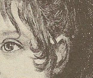
Here in Gimbrede's engraving we see all the classic identifiers of steel plate
"line" (the girl's hair) & "stipple" (the girl's face) engraving. In the background (where we usually see parallel or
curved lines) , the engraver has chosen a common technique called "crosshatching", where vertical & horizontal lines cross each other in a tight pattern. However , the over all quality of the print is
clearly dependent more on the skill of the artist , not on a particular technique.
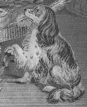
Comparing the "block" or "square" nature of the dog's profile (above) , as
well as the overall flatness of the image is both a testa-ment to the artist's skill as well as the quality of the printing
impression.

If you are as accustomed to retreating to the dictionary as I, you'll be in trouble
if you're trying pin down art terms. The above halftone print (1897) represents the final nail in the coffin for the virtual
demise of classi-cal intalglio (engraving). Our "Knowing the Difference" pages are being developed as a user friendly
tool , so I'll not belabor the history of complicated ( sometimes convo-luted ) processes inherent in print develop-ment. Suffice
to say the halftone , invented circa 1890 , was a culmination of a purely photographic ingenuity that began with
the "heliogravure" in 1850s France.
First "suggested" by William Fox Talbot in 1852 that tonal quality could be "improved"
over the then current mechanical pure black and white process by introducing a photographic screen, which would not be first
developed until the 1880s, and not used commercially with any great success until the 1890s, when newspapers and period-icals
began to adopt the process. Although the halftone was developed to create a "greater tonal range", it also succeeded in "dummying
down" the overall quality in the engraving process,as easily evidenced
in above enlargment. The birth of halftones was the beginning of flat tones.
Here we see the dot matrix of the halftone "internegative"; the size and distribution
of the regular pattern dots dictate the tonal distribution; the greater density, the "great-er quality". Even then, in
1897, "greater quality" was a stretch. Now, sadly, it is taken for granted. When you see this reg-ular dot matrix under
magnification, it means you're NOT looking at an engraving or lithograph.
|
 |
|
|
|
|
|
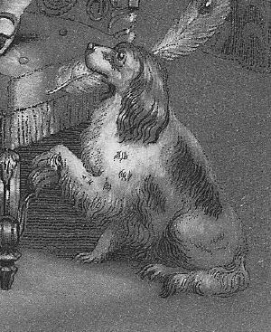
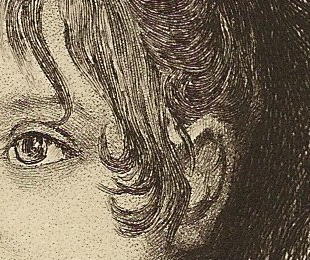
John Sartain was the most prolific (and the best) of but a handful of 19th century
American mezzo-tintists. Although his mezzotint (above) is smaller (7 7/8" X 5 3/8") than the Gimbrede line & stipple
(8 3/4 X 5), the superior quality of the mezzotint is readily assessible to the viewer. Both "line & stipple" and "mezzotints"
are engravings, and belong to the "intaglio" catagory of prints. (See "Art Terms")
Smooth surface and contrast are qualities inherent in
the more complicated technique of most mezzotints (again, assuming the artist is skilled enough to utilize the advantages).
Note the uniform smoothness of both the face & hair, and the singular "pitted" lines that serve to outline the figures
image, a characteristic that makes most mezzotints easily identifible. The reason many artists were attracted to mezzotint
technique is that a basic principle in academic art, "chiaroscuro" (light from dark), was more readily attainable.
Again we can see the skill of the artist at work on the dog's profile (above) ; it's not
just the mezzotint tech-nique at play here , but clearly Sartain's talent in executing the subject at hand.
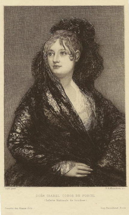
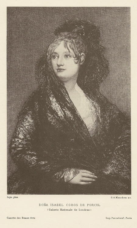
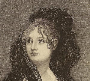
Around the turn of the 19th century, the well known French art periodical "Gazette des Beaux-Arts"
began to print duplicate halftone and etchings of the same image to lend instruction to the public about the differences inherent
in both intaglio (engraved or etched images) and the new, halftone process, a much cheaper form of photograhic reproduction.
The above etching after Goya was printed simultaneously along with the halftone to the left in 1897. Although this French periodical would
continue to print high quality etchings up until the 1920s, halftones became the dominate form of reproduction, beginning
in the 1890s.
Although the above etching is not the best example of the art, the depth, contrast and clarity
remain superior to what was already becoming the ubiquitous halftone. The halftone and photograph put hundreds of talented
engravers out of work, and slowly eroded the public's perception of quality "reproductive" art. Eventually, the engraver's/etcher's
art would become only a memory, and later, to most of the reading public, virtually forgotten.
Now the etched lines are clearly visable...
...Actually, despite the ignorance and loss of a quality image on the public consciousness
engendered by "half-tone" photo-reproductive shortcuts, some dealers are privately reconciled, if not pleased with such a
develop-ment. The change (eventually) made the engravers' lost art scarce and sought after as a highly collectible relic of
the past. Today we see the "worm has turned" once again with the advent of digital matrix...
Click links to navigate pages :
|
|
|
|
|